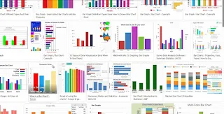
A bar chart is a type of chart that presents categorical data with rectangular bars. The lengths of the bars are proportional to the values they represent. Here's how you can teach a bar chart:
Introduction to Bar Charts:
Start by explaining what a bar chart is and when it is used. Emphasize that it's suitable for displaying and comparing data in different categories or groups.
Components of a Bar Chart:
A bar chart is a graphical representation of data that uses rectangular bars to display and compare the values of different categories or groups. In a bar chart, the length or height of each bar is proportional to the value it represents.
Bar charts are typically used when you want to:
Compare Categories: Bar charts are excellent for visualizing and comparing the quantities or frequencies of different categories or groups. For example, comparing sales figures for different products, or the performance of different teams.
Show Trends over Time: Bar charts can be used to display data over time, especially when the time intervals are discrete (e.g., months, years).
Display Categorical Data: They are ideal for displaying data that falls into distinct categories, such as types of fruits, countries, or job titles.
Highlight Differences: Bar charts make it easy to see disparities between different categories. This can be useful for identifying areas that may need attention or improvement.
Present Non-Continuous Data: Unlike line graphs, which are suitable for continuous data, bar charts work well for data that can be categorized into distinct groups.
Visualize Rankings: Bar charts are effective in showing rankings or order of items in terms of their values. For instance, which products are the best-selling or which countries have the highest population.
Compare Sub-Groups within Categories: Grouped bar charts allow you to compare sub-groups within each category. For example, comparing the performance of different departments within a company.
Remember, the choice of chart depends on the nature of the data and the story you want to convey. A bar chart is a powerful tool, but it's important to select the right type of chart for your specific dataset and message.

Here's an explanation of each type of chart:
Line Chart:
A line chart is a graphical representation of data in which information is displayed as a series of data points connected by straight lines. The x-axis typically represents time or continuous numerical values, while the y-axis represents the corresponding values or measurements. Line charts are commonly used to show trends, changes over time, or relationships between variables. They are effective for visualizing continuous data sets.
Pie Chart:
A pie chart is a circular graph divided into slices, each representing a proportion of a whole. The size of each slice is proportional to the quantity it represents. Pie charts are useful for displaying data with distinct categories and highlighting the relative contributions or percentages of each category to the total. They are commonly used to represent data in a visually appealing and easy-to-understand format.
Scatter Plot:
A scatter plot is a two-dimensional graph that uses dots to represent individual data points. Each dot on the graph represents the values of two variables (one on the x-axis and one on the y-axis). Scatter plots are used to identify relationships or correlations between the two variables. They are especially helpful in visualizing data points in a way that helps identify trends, clusters, or outliers. Scatter plots are widely used in statistics and data analysis.
In summary:
Line Chart: Shows trends or relationships between continuous data points over time or along a numerical scale.
Pie Chart: Displays the composition or distribution of a whole into distinct categories, with each category represented as a slice of the pie.
Scatter Plot: Reveals the relationship and distribution of data points between two variables, allowing for the identification of patterns or trends.
Each type of chart serves a specific purpose in visualizing data, and choosing the right one depends on the nature of the data and the story you want to convey.
Break down the different parts of a bar chart: the x-axis (horizontal axis) representing categories, the y-axis (vertical axis) representing values, and the bars themselves.
Choosing Data for a Bar Chart:
Provide a set of data that is suitable for creating a bar chart. For example, you can use data related to a survey, such as favorite colors of students.
Creating a Bar Chart:
Demonstrate how to construct a bar chart using graph paper, a whiteboard, or a computer software like Excel or Google Sheets.
Show how to label the axes, choose appropriate scales, and draw the bars.
Interpreting a Bar Chart:
Present a bar chart to the students and guide them through the process of interpreting it. Discuss what the chart is telling us about the data.
Comparing Data:
Use multiple bar charts with different datasets to teach students how to compare information across different categories.
Types of Bar Charts:
Introduce variations like grouped bar charts (for comparing different groups within categories) and stacked bar charts (for comparing sub-categories within a larger category).
Discussing Trends and Patterns:
Encourage students to identify trends, patterns, and anomalies in the data represented by the bar chart.
Hands-on Activities:
Provide worksheets or exercises where students have to create their own bar charts based on given data.
Real-life Examples:
Show examples of bar charts used in newspapers, reports, or online articles. Discuss how they effectively convey information.
Group Activities:
Have students work in pairs or small groups to create and interpret bar charts. This encourages collaboration and peer learning.
Assessment and Practice:
Evaluate their understanding through quizzes or assignments that require them to create and analyze bar charts.
Remember to adapt the complexity of the lesson based on the age and proficiency level of the students. Encourage questions and discussions to ensure that they grasp the concept thoroughly.
Introduction to Past Tense:
Begin by explaining that the past tense is used to talk about actions or events that have already happened.
Regular Verbs:
Start with regular verbs. These verbs form their past tense by adding '-ed' to the base form (e.g., walk - walked, play - played).
Irregular Verbs:
Introduce irregular verbs. Explain that these verbs do not follow a regular pattern in forming their past tense (e.g., go - went, eat - ate).
Pronunciation of Regular Past Tense:
Practice the correct pronunciation of regular past tense verbs. Emphasize the 'ed' sound (/ɪd/, /t/, or /d/) depending on the final sound of the base form.
Examples and Drills:
Provide examples of regular verbs in sentences and have students practice forming the past tense. For instance, "She walked to school yesterday."
Irregular Verbs List:
Introduce a list of common irregular verbs. Encourage students to familiarize themselves with the past tense forms.
Pronunciation of Irregular Past Tense:
Practice the correct pronunciation of irregular past tense verbs. Focus on the specific changes in vowel sounds (e.g., sing - sang).
Examples and Drills for Irregular Verbs:
Use irregular verbs in sentences and have students practice forming the past tense. For example, "He ate pizza for dinner last night."
Contrasting Regular and Irregular Verbs:
Highlight the difference between regular and irregular verbs when forming past tenses. Reinforce through exercises.
Reading and Listening Activities:
Provide texts or audio clips with various past tense forms. Ask students to identify and analyze the past tense verbs used.
Role Play and Storytelling:
Encourage students to create short stories or engage in role plays using past tense verbs. This allows for practical application.
Error Correction:
Provide sentences with incorrect past tense forms and ask students to identify and correct the errors.
Regular Review:
Include regular practice of past tense forms in future lessons to reinforce learning.
Assessment:
Evaluate their understanding through quizzes, written assignments, or oral presentations that require the correct use of past tense forms.
Encourage Usage:
Create opportunities for students to use past tense forms in everyday conversations or written exercises.
Remember to provide ample examples and opportunities for practice. Encourage a supportive learning environment where students feel comfortable making mistakes and seeking clarification. Additionally, reinforce the importance of context in choosing the correct past tense form.


Tidak ada komentar:
Posting Komentar